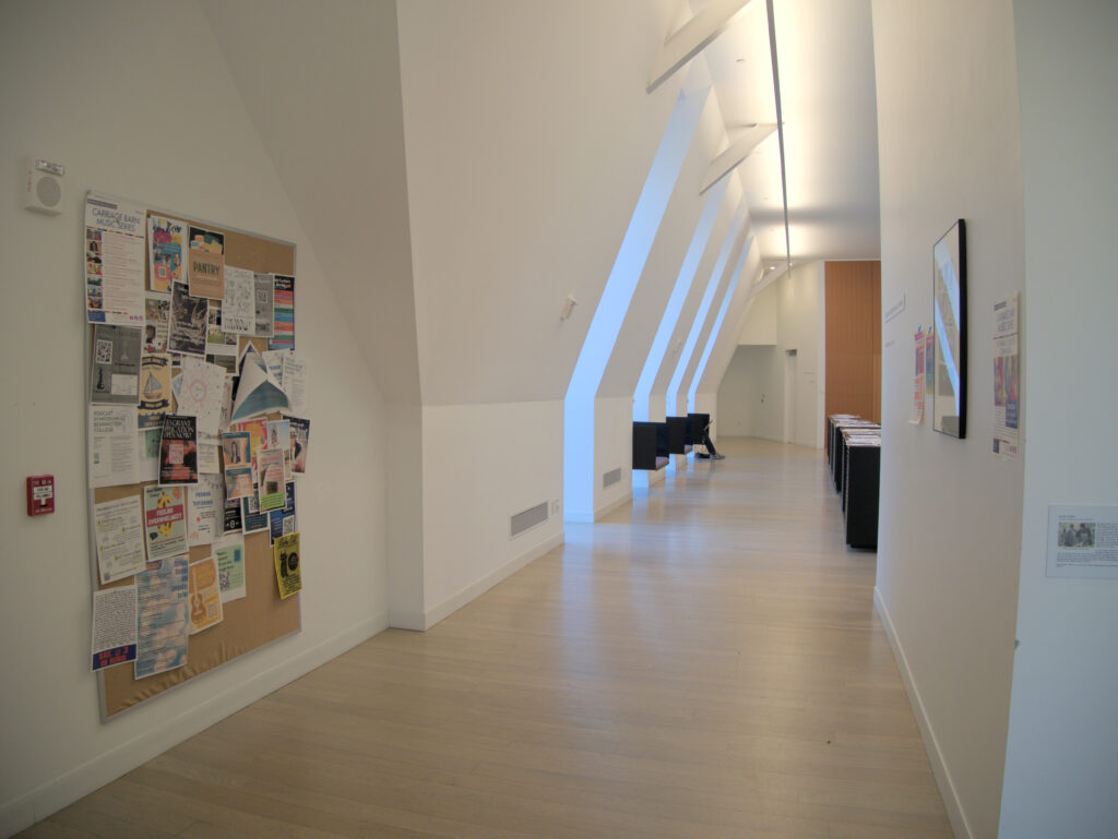
The top floor of commons separates itself from the rest of the building. It has the most open space, excluding the dining hall, but the dining hall has such a clear purpose. One enters the dining hall and is immediately a diner, but when one enters the top floor commons they assume no role. Commons level three has classrooms. They are rooms with non-prescribed functions: one can aimlessly walk and look at the paintings. The walls, on the other hand, are for the art that has been thoughtfully purchased or donated and then hung. It fails to consider the posters. There are designated places for them, yes, but they are exactly that: designated places. A designated place does not do a poster justice. They are not paintings with frames necessitating hooks and nails; they are ephemeralities that grow freely. They are reflections of the campus, and to perfectly reflect it, it must be hung laissez faire– without the cork boards directing where to put the poster. However, this space is hostile.
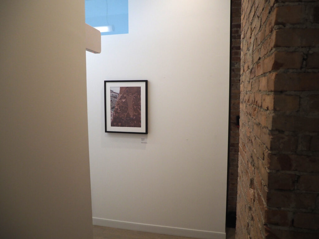
Moyra Davey, Cave Painting
The photo was taken from a cramped angle. An observer imagines the photographer in a crevice balancing one foot on a jagged stone; the other wedged further onto a pitch of the mountain. This is echoed in the tight corner one must mold into to see the photo head on. The subject of the painting is a sketch from prehistory contradicted by the camera creating the art in the background. This is felt in the space by the exposed brick. The brick, juxtaposed with the high white walls and sterile light, takes the role of the cave painting– a mark of a time before any of us were here. We have no idea how the brick was situated in the old Commons; just as we cannot imagine the cave painting being in the context of its time. And this is immediately contrasted with the modern– the camera and the remodeling. It is a fitting place for the piece.
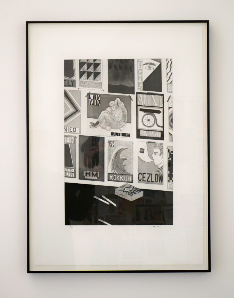
Yuri Masnyj, Show Cards and Cigarettes
This piece greets anyone arriving up the stairs from the dining hall entrance of Commons. It’s a monochromatic wall lined with posters and a countertop with a pack of cigarettes– three unsmoked invitingly set on the counter. Perfect for Bennington students! Here’s a painting encapsulating what you guys are. Yet, the reason it feels so trite is the setting. It looks fitting for the wall, but the very image it cultivates is not acceptable in the space. We can’t smoke inside, but more importantly we cannot hang up posters, as the poster correctly assumes we want to. It is a tantalizing exercise of control– we know you guys like this, but you can’t have this here. This point is extrapolated from the cork board adjacent to it. This cork board is the spot allocated for students to pin their ideas onto. When observing this pice, there were posters hung next to it, awkwardly off to the side. Awkward ,not on account of the hangers and creators of the posters, but because on the white walls that resembled a modern art gallery too much, the posters appear as though they are trespassing into the visual real estate of the painting.
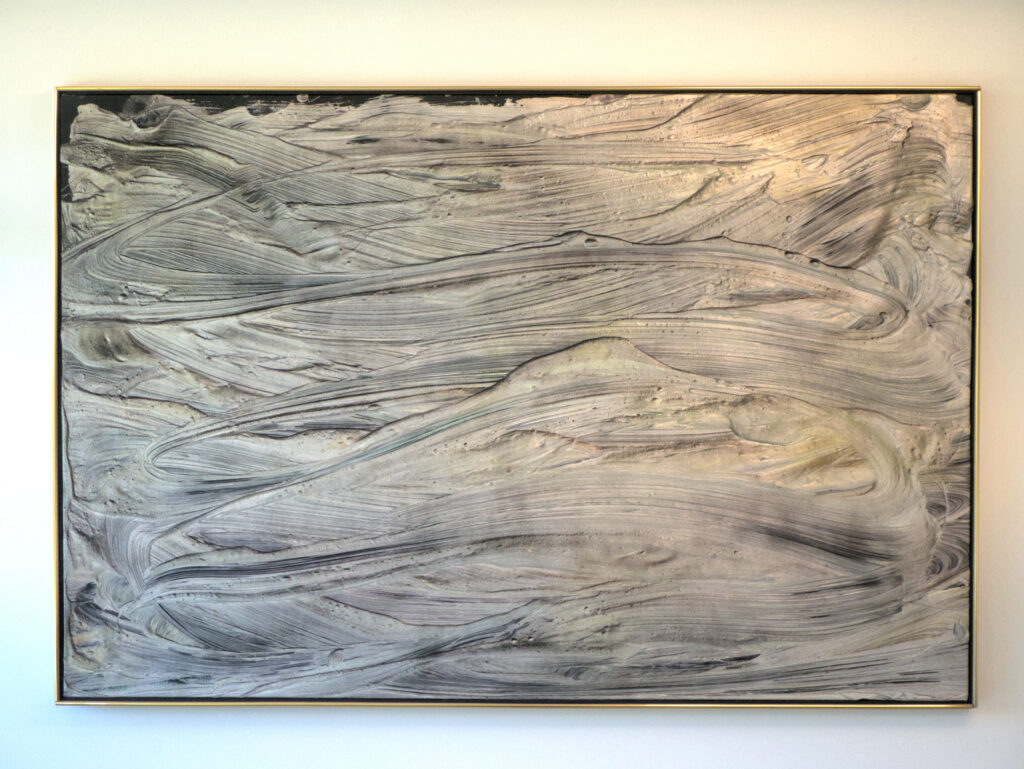
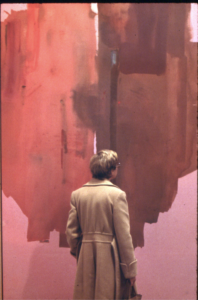
Jules Olitski, Orant of Asmar
Although it has no bright colors, the heavy texture radiates from the piece, giving it a large presence in the room. Large cool dark brush strokes swirl into dessert dunes at night. The painting creates an ever-changing tide of sand: creating, shifting, and destroying itself to arrange a beautiful row of dunes, then a completely different one. It fits the room because it’s the only art in this very special room, and it fills that spot completely, but the authorized art was overshadowed by the waves of ephemeral artwork. The painting hints at this ever-shifting thing, but directly opposite to it is a whiteboard with art being drawn and erased every day, as well as the posters to be taken down and replaced by new posters on the windows overlooking D-Hall for the routine weekend parties.
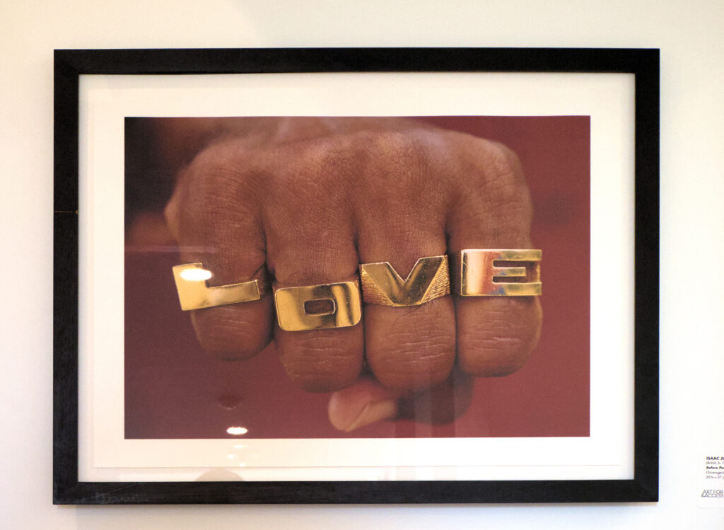
Isaac Julian, Before Paradise (Love)
Shocking anyone turning the corner, the vivid cherry red breaks from the pastel and line sketches leading up, but it packs the wrong type of punch. Rings spell out “LOVE” resembling brass knuckles. What is this work of art trying to communicate? Love is powerful? Love is like being punched? All of these statements are so simplistic and have no nuance. The piece tries to be vivid, this is even furthered by its placement among the pastels and sketches, but it comments nothing, appearing static. It misses.
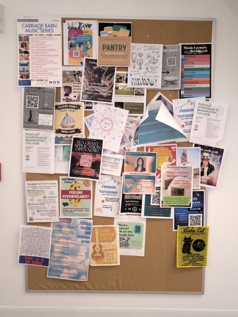
Posters
The art on the walls is planned well for the space, but it is planned without taking into consideration the posters. The walls are antagonistic to the posters. A striking dichotomy is the posters on the west side of the main hall. They are advertising the foreign language tutors above the tables where the lessons occur, making a line of these posters. Each one is flanked at all sides by an excess of negative space– highlighted by the white color of it. But what makes them even more ostracized, is the plaques that alternate between the posters. The plaques are descriptions of alumni at the base of white light fixtures. The posters are viewed simultaneously with– if not always– in relation to these plaques. At a glance, this seems fitting: description of an alum and an artifice of a current student. It could even be complimentary, but the design of the installed plaques is not complimentary to that of the rogue poster. The bright colors feel unserious compared to the plaques; they feel like vandalization. They are like trespassers onto the territory of white, negative area. In such a community space, posters should not feel this way. The only place the posters do feel appropriate is on the black counter that lines the walkway in the hall. But they are only comfortable there because of the large quantity of them. They have become fitting themselves with no help from the walls.
The design of commons feels corporate. It has glass doors, clean white lights, sleek square tables, and black, plastic, modern chairs. The emphasis of this corporatism is not to imply it is like a business, but to make it clear that this space is a hyper-designed space. It is a finished space, and that’s not how we treat it: students treat it as an ever-evolving collage of art. Most of the framed art hung is beautiful and is well-placed, but it is in contact with the creativity of the students and their posters. It does not corroborate creativity. In the best cases, it stands awkwardly to the side, and in the worst, it contradicts the students entirely.


Be First to Comment